Thursday, 18 May 2017

Task 4 - Evaluation and Review

Task 1
on task 1 I started out learning different techniques that would later become very useful and I learnt what I could and couldn't do that well but that didn't stop me from trying out new things to improve my repertoire of art skills using different items, techniques, inks and paints. As someone who works mostly on computers and not using physical pains and learning these basic art techniques I actually found the work quite irritating and didn't see the point of what we were doing when we first started but at the end and looking back at it I can now see that I really have learnt a lot and that the techniques have helped me. The first think I did was the cross hatching, stippling and shading which I didn't really understand the point of the first two since you don't really see that at work when you look at games but I started to understand by doing it with paints I was able to create interesting patterns aswell as make something that I wouldn't normally. The shading techniques seemed more important since almost every drawing looks incomplete without shading on it. Next I started to learn what techniques suited me more and which I didn't like using because I either found them difficult to do right or because the effect they gave out wasn't to my liking. I know that I made sure to try all the way through my work because I am very serious about what I do.
Task 2
during task 2 I started seeing that my work was starting to shape and come to life a bit more when I was adding detail into the pictures that I was making and I started feeling more motivated because I could finally see what was in front of me. all the stippling and crosshatching that felt pointless before didn't anymore and I felt more motivated to do my work. The first picture was quite simple where I cut up some of my work from the first task and put it together to create a whole new image which I think taught me to not give up on my work because it takes time and effort to create something good.
Task 3
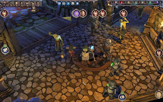
in task 3 I chose pictures from video games of dungeons for my inspiration not because I liked the games that they were in or because the games seemed good but because each image had unique yet great art and that I believed that with these images id be able to create something that I’d like and when I first designed the image I made something that I understood and would like to make using a few of the images that I had collected which made what I was going to do next so much simpler. at this point I was truly motivated to take everything that I had learnt from task 1 and 2 and create something that I could be happy with and I did because I really did enjoy and like what I had made and I also learnt some other things such as knowing when enough is enough to my work which I will remember in the future so that I can continue to improve my work
Overall
Overall I think I learnt quite a bit from new techniques, more art vocabulary and just more about myself as a artist in general. My work may not be the best but I am willing to improve it and try hard to reach my goal.

Task 3 - Combining Media and Materials

For the final task i had to collect a multitude of images for inspiration so that i could create a either a interior or exterior, these images could be chosen from real life or video games and i chose the latter with a dungeon. I used a multitude of dungeons to get an idea of what the stone effects they had, the perspective, what extra things they included and a few other things. i didn't base it off a video game that i have played but instead what designs i liked and i took from a multitude of games so that i could create something that i liked.


What i had to do next was a inspect the images that i had collected and choose what stood out to me as a designer and then designed it out on the following piece of paper. this sheet includes a simple sketch opf what i wanted as well as a explanation of what techniques that i have used before to recreate this

Now the hard part which was actually creating the final piece of work. First i made a few grey colours of differnt shades and used the rolling pinto put tghem onto a sheet of paper. I knew that i coulnt prpoerly predict the colours i was going to get with the rolling pin but did it for that reason bdecause i wanted a stony effect.

next i added a piece of tissue to paper with glue and then added a lighter shade of grey along so i could get a stony effect which stood out to those who looked at it

the Next thing i had to do on this sheet was mark with a pen what i wnated to cut out which i did

i later stuck it to a the first sheet to give my work a 3D effect. i had to then add detail to give life to my work such as the brick texture which i carefully lay out before hand with pencils and rulers calculating the distance between them. i then added paint on top to make runes and torches that really stood out because of the colour difference. i decided that i really liked this but had already planned something extra on top so i took a picture before adding extra.

Finally i added stippling to the image to recreate the blue floating lights from a image i liked but i decided that on the 2D sheet it didn't look at good which allowed me to learnt that i should watch out and know when enough detail is enough.


http://www.pctechauthority.com/online-game-arcade/online-interactive-games.html
http://be.riotpixels.com/games/legend-of-grimrock/screenshots/116/
http://dl.3dmgame.com/201204/19027.html
http://www.gameguides.cc/Article/gameguides/I/201512/13016.html
http://www.f2p.com/gamigo-announces-dungeon-empires/
http://rupor.sampo.ru/topic/15843

Task 2 - Environment

After completing the blending exercise from task 1 i then had to photocopy it and cut apart the sheet so that i could make miniature environments. On the first image i took the blue and yellow to create a sky, sea and beach to which i later added detail such as a sun at the top and drew on waves and birds across the sky and even a small crab at the bottom to give a easier understanding to what you are looking at.

For the second one i used where the blue and orange were blended together to create a nice sunset and then used the paint cross hatching to represent a earthly look to it.

This design shows the interior of a house or a tree house. i used the paint cross hatching to create wood like walls and yellow to make planks for the flooring. To finish it off i added detail such as blue to make a window in the day and used pencil to create a wooden floor and door.


Task 1 - Markmaking

Markmaking
Pencil
For my mark making i used both HB and 6B pencils. with these two different pencils i created three different types of marks: cross hatching, stippling and shading so that i could compare them and be able to see which pencil would be better for different situations so i can tell what i should use in the future.

The marks the HB pencil are sharper compared to the 6B marks which are softer and more blunt, which in my opinions makes the HB pencil more useful for a more detailed approach. on the other hand is the 6B pencil which is darker and needs more maintenance because of how soft it is and i decided that this pencil has more use when it comes to shading rather than using it to draw but can still be used on bigger drawings or drawing that have a darker theme.

HB Pencil


6B Pencil


Pen
Using the same methods as before i also used pen to see the effectsd that i could get out of it. Using a fine line pen i created cross hatching marks that i noticed were thinner, more detailed and darker than either of the pencils and depending on hiow much pressure you use its quite easy to change the shade you get out of them. The stippling was also darker but since i was rushing the dots i ended making it far less tidy which is something that id need to remember if i were to use it later on. Lastly since i couldn't shade with the pen i scribbled on the page and added water to make the ink run which game a night time feeling along with a cloudy black which faded to white.


Toothpick and black ink
The last method and my least favorite mark making technique was created by using a  toothpick and black ink since it needed the most control over the pressure and you needed to know how much ink to use because of this the marks can go from very inky, thick and hard to control which then became thin marks which started to the fade so the toothpick needed the most maintenance since it would start to go blunt and loose ink. For the stippling it was very hard to control since if you wasn't careful you would make a huge blob or smudge them. Finally we had to create our own pattern which i made a intersecting wavy pattern since i was trying to take control of the huge blotches of ink.


Colours Making
The second main task involved lots of experimenting to see what would suit me. i had to use a plentiful of items such as brushes, sponges, tissue and even a rolling pin to recreate a bunch of images or at least try and gain a similar effect as what was on them. we put all of the work on a sheet of A3 with 12 designs placed upon them, this would lead later into my future projects such as my environment so it was quite important.


The first piece of work on the sheet was created by using a rolling pin. i used one that was sticky and less clean than the other we had and i did this to see if i could create a interesting mark but while using the rolling pin i learnt that its hard to get pint on all of the surface so to make the most out of this i would have to use the rolling pin with a lot more paint or a surface that has\already has colours on it.

For this design i added plain water to the sheet and then later added paint to the water so that the paint would run and by doing this and i was able to get a greater effect by adding another colour on top of it. i believe that a bit of extra detail and with the right colours i could get a swampy effect from it.

For the third design i used paint and then bubble wrap, first i used a golden colour to create a back ground and then used the bubble wrap to dab on the page so that i could create a far thicker stippling effect than what i had before.

For this one i used the rolling pin again but this time i used a lot more colours at the same time and really liked the effect i got off it. if there was a lot more of it or it was on a darker colour i think it would have a much greater effect.

for this one i added glue to the sheet and then added paint later on so that i could create a 3D effect on the page, one of the biggest problems i had with this one was that the glue took a lot longer to dry because it was so thick and the effect wasn't like what i was expecting.

This one was simple but looked really nice because all it was was black acrylic paint with water which almost made it look like a cumulonimbus cloud before lighting came out or a dark typhoon like effect.

this one was very simple i added glue to the page and put tissue on top of it and then added paint on top. looking back on this one i really liked it because if i could of changed the paint i used to black and added yellow to the marks it would look like a lightning bolt at night.

 i tried reusing the water then paint technique again but this time after adding the first layer of paint i added big blotched to the sheet and let them fade into the other parts to get a different look the the paint.

i tried out the pastel this time and then used paint on top of it. i made symmetrical marks on the sheet and added blue to the top of the sheet and then faded it into red and because of the white pastel which was originally added i got red, blue and purple which some interesting white markings.

this one was quite simple since i added paint to the sheet then added more paint on top with a sponge which gave a very interesting effect such as a wavy effect inside of the second layer of paint.

this was my least favourite on how you actually do it, since i used a glue spreader to spread paint which i found quite hard to do since its hard texture. The effect it gave off wasn't that bad but was too difficult to perform for a bigger design.

i tried to recreate the image that i had done earlier with the glue spreader with tissue and paint instead but still didn't like the effect it gave off because of how many colours there were and how they weren't blending together so in my opinion it would be best to recreate it with something much finer such as just using paint normally or using felt tips.


The next exercise that i had to do was a colour blending exercise. we had to make 9 squares. On the first square of each row i had to add water inside of the square and then fully colour/blend paint into it with oil paint. On the first square of each row i had to use a different yet very similar technique where i wet the paper again but this time just put paint at the very top and blend it downwards so that it faded in. In the last squares i wet the page again but this time blended all the colours together as i went down the page which helped me understand how to blend colours easier.

The final piece on task 1 included me using the cross hatching but with brown and green paint which gave me a very interesting nature like effect to the page which became useful later on.


Wednesday, 1 March 2017

Spider Diagrams

To start off my project i created two spider diagrams one about a magical forest and another about an urban street


After making those first two i used a software to create a more neater one that was more organised and had a few more details on them.


Tuesday, 28 February 2017

Concept Boards

Next the entire class chose what these they would create there environment about and made concept boards for those ideas. The concepts that i found was all about a enchanted forest so the images that we gathered to make the concept board consisted of things like magical creatures such as tree Ents, fairies, dragons, unicorns and other such creatures. we also chose huge mushrooms, and blue forests since they gave off the greatest "magical" vibe but not only did we gather images on magical forests we also got them on regular forests since they would be a could reference while we were making our design. 

While maiking and sampling my designs, i continually looked at more designs that i found on the internet, this picture that i found had a very nice design that i thought would work quite well which i did use.


A different group chose to a walled city which was quite similar to the roman empire so that's where they got all of their inspiration. Using pillars, walls and even men that look like gladiators as inspiration. everything looks sandy and stony. the imagery includes places like the Colosseum.
The next group chose to make a martian settlement. The images that they used includes red sand as well as more hi-tech things to represent the settlement because to actually get to mars and make a hi tech settlement their technology would have to be far past ours. They used lots of different designs since we don't have any settlements there so we have to imagine what they would be like.
The last group chose a Victorian street and so they end up using mostly real images such as real streets in London, the original lamp posts, the earliest trains and even carriages.


https://www.pinterest.com/pin/512917845037290869/
http://zelda.wikia.com/wiki/Navi